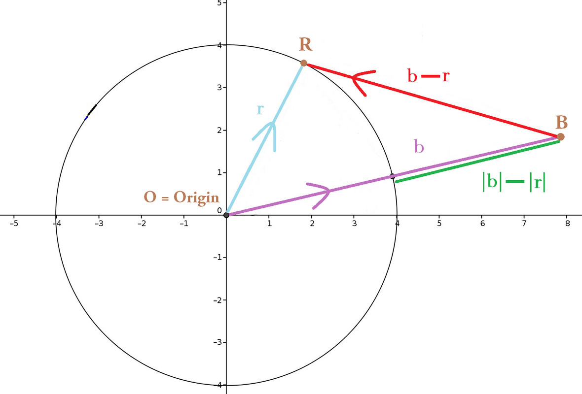
How can I improve contrast of red and green, to prove Reverse Triangle Inequality?
I need to improve this original diagram to the one beneath, because this diagram reappears on standardized tests with different letters, orientation, position of the vectors. Tests require students to distinguish and label $\color{limegreen}{|\vec{b}| - |\vec{r}|}$ versus $\color{red}{\vec{b} - \vec{r}}$.
But some parents and students gripe that $\color{limegreen}{|\vec{b}| - |\vec{r}|}$ looks too identical, particularly in length, to $\color{red}{\vec{b} - \vec{r}}$. Plainly by eye, my diagram fails to convince them that $\left|\color{limegreen}{|\vec{b}| - |\vec{r}|}\right|$ ≤ $\left|\color{red}{\vec{b} - \vec{r}}\right|$.
How can I improve my diagram? How can I better contrast, or even amplify, the differences (in length) between $\color{limegreen}{|\vec{b}| - |\vec{r}|}$ vs. $\color{red}{\vec{b} - \vec{r}}$ ?

1 answer
The obvious answer to how to amplify the the difference in length between $|\vec{b}| - |\vec{r}|$ and $|\vec{b} - \vec{r}|$ is to set $r = -b$ so that one difference is zero and the other is arbitrarily large.


1 comment thread