Communities

Writing
Writing
Codidact Meta
Codidact Meta
The Great Outdoors
The Great Outdoors
Photography & Video
Photography & Video
Scientific Speculation
Cooking
Cooking
Electrical Engineering
Judaism
Judaism
Languages & Linguistics
Software Development
Mathematics
Mathematics
Christianity
Christianity
Code Golf
Code Golf
Music
Music
Physics
Physics
Linux Systems
Linux Systems
Power Users
Power Users
Tabletop RPGs
Tabletop RPGs
Community Proposals
Community Proposals
tag:snake search within a tag
answers:0 unanswered questions
user:xxxx search by author id
score:0.5 posts with 0.5+ score
"snake oil" exact phrase
votes:4 posts with 4+ votes
created:<1w created < 1 week ago
post_type:xxxx type of post
Search help
Notifications
Mark all as read See all your notifications »
Q&A

Comments on How can I improve contrast of red and green, to prove Reverse Triangle Inequality?

Post

How can I improve contrast of red and green, to prove Reverse Triangle Inequality?

+0
−4

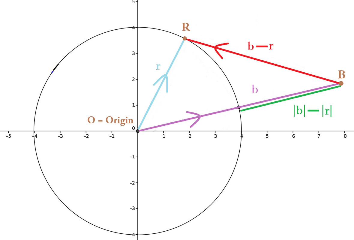
I need to improve this original diagram to the one beneath, because this diagram reappears on standardized tests with different letters, orientation, position of the vectors. Tests require students to distinguish and label $\color{limegreen}{|\vec{b}| - |\vec{r}|}$ versus $\color{red}{\vec{b} - \vec{r}}$.

But some parents and students gripe that $\color{limegreen}{|\vec{b}| - |\vec{r}|}$ looks too identical, particularly in length, to $\color{red}{\vec{b} - \vec{r}}$. Plainly by eye, my diagram fails to convince them that $\left|\color{limegreen}{|\vec{b}| - |\vec{r}|}\right|$ ≤ $\left|\color{red}{\vec{b} - \vec{r}}\right|$.

How can I improve my diagram? How can I better contrast, or even amplify, the differences (in length) between $\color{limegreen}{|\vec{b}| - |\vec{r}|}$ vs. $\color{red}{\vec{b} - \vec{r}}$ ?

History
Why does this post require moderator attention?
You might want to add some details to your flag.
Why should this post be closed?

1 comment thread

Red and green is a poor choice for distinction colors (1 comment)
Red and green is a poor choice for distinction colors
Canina‭ wrote 8 months ago · edited 8 months ago

You don't say whether the colors are the same in the diagram you show here as in the one presented to your students, but:

Perhaps counterintuitively for many, red and green is a really poor choice for trying to clearly distinguish between two things, especially with no other context.

Red/green color blindness is, as I recall, the most common type of color blindness in people; a fairly significant portion of the population (on the order of several percent) suffer from that condition.

Which means that in a group of, say, 25 students, you can realistically expect that statistically at least one of them will have some degree of difficulty in telling red and green apart.

As a general rule of thumb, and this is also codified e.g. by WCAG (web accessibility), avoid using color as the only differentiator.

Even if that's not the problem in this case, if you are actually using these colors, do consider switching to colorblind-friendly alternatives.