Post History
#3: History hidden
How can I improve contrast of red and green, to prove Reverse Triangle Inequality?
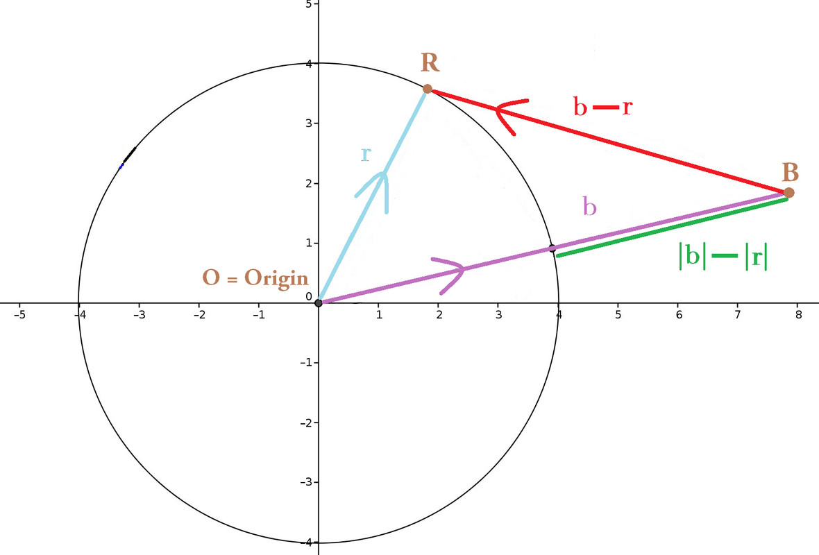
I need to improve [this original diagram](https://math.stackexchange.com/a/774233) to the one beneath, because this diagram reappears on standardized tests _**with different letters, orientation, position of the vectors**_. Tests require students to distinguish and label $\color{limegreen}{|\vec{b}| - |\vec{r}|}$ _versus_ $\color{red}{\vec{b} - \vec{r}}$.
But some parents and students gripe that $\color{limegreen}{|\vec{b}| - |\vec{r}|}$ looks too identical, particularly in length, to $\color{red}{\vec{b} - \vec{r}}$. Plainly by eye, my diagram fails to convince them that $\left|\color{limegreen}{|\vec{b}| - |\vec{r}|}\right|$ ≤ $\left|\color{red}{\vec{b} - \vec{r}}\right|$.
#### How can I improve my diagram? How can I better contrast, or even amplify, the differences (in length) between $\color{limegreen}{|\vec{b}| - |\vec{r}|}$ vs. $\color{red}{\vec{b} - \vec{r}}$ ?


