Post History
#2: Post edited
by
 DNB
·
2021-08-05T01:46:23Z (almost 4 years ago)
DNB
·
2021-08-05T01:46:23Z (almost 4 years ago)
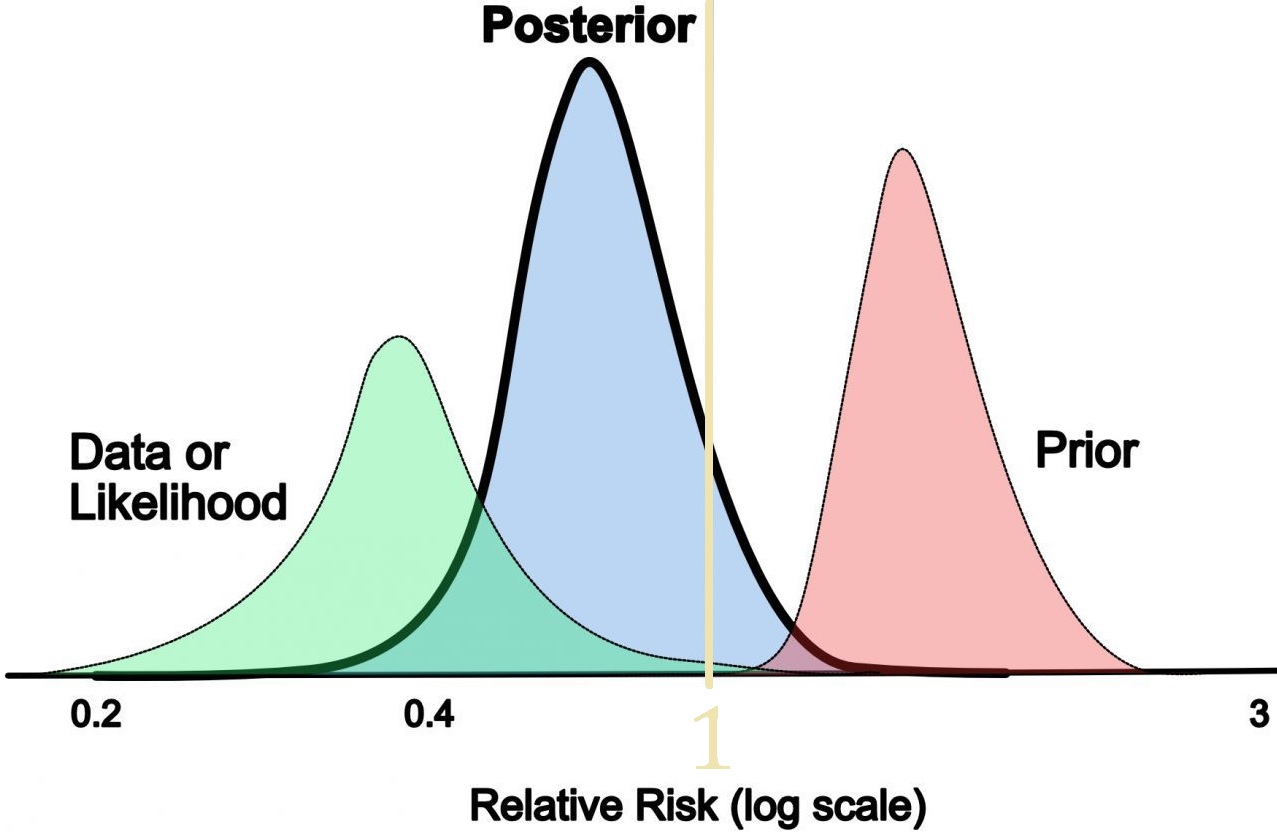
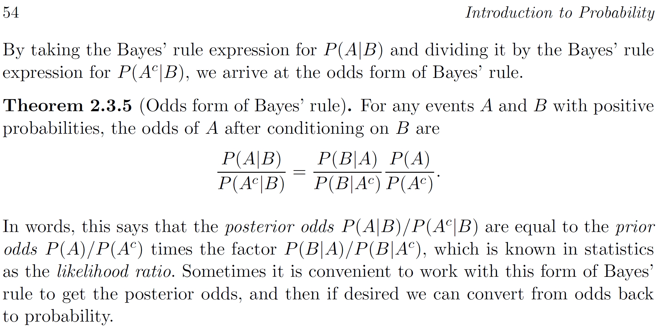
- I learn best visually, and I found these [graph](https://www.thebottomline.org.uk/blog/ebm/bayesian-statistics/). 1. Does it furnish intuition on Theorem 2.3.5 below?
- 2. E.g. Is the Likelihood Ratio always graphically left of Posterior and Prior? If so, why?
- >This can also be pictorially represented – the graph below shows the new posterior belief for a certain treatment has a reduced relative risk when the prior belief is combined with the data collected.
- 
- 
Blitzstein. *Introduction to Probability* (2019 2 ed). p 53.
- I learn best visually, and I found these [graph](https://www.thebottomline.org.uk/blog/ebm/bayesian-statistics/). 1. Does it furnish intuition on Theorem 2.3.5 below?
- 2. E.g. Is the Likelihood Ratio always graphically left of Posterior and Prior? If so, why?
- >This can also be pictorially represented – the graph below shows the new posterior belief for a certain treatment has a reduced relative risk when the prior belief is combined with the data collected.
- 
- 
- Blitzstein. *Introduction to Probability* (2019 2 ed). p 53.
- [Here](https://arbital.com/p/bayes_rule/?l=693) are more details and better pictures of Theorem 2.3.5.
#1: Initial revision
by
DNB
·
2021-08-05T01:45:09Z (almost 4 years ago)
How do these 3 bell curves of Likelihood, Posterior, Prior pictorialize the Odds form of Bayes' rule?
I learn best visually, and I found these [graph](https://www.thebottomline.org.uk/blog/ebm/bayesian-statistics/). 1. Does it furnish intuition on Theorem 2.3.5 below? 2. E.g. Is the Likelihood Ratio always graphically left of Posterior and Prior? If so, why? >This can also be pictorially represented – the graph below shows the new posterior belief for a certain treatment has a reduced relative risk when the prior belief is combined with the data collected.   Blitzstein. *Introduction to Probability* (2019 2 ed). p 53.