Discrete data: Graphs and skewness
I am studying an introductory course in statistic " Essentials of Statistics". The author mentioned that Histograms are used to represent the frequency distribution of a contiuous data. Then directly, he explained how to detect if there is skewness in the data using histograms. Later he highlted some other types of plots and graphs including the bar chart.
What is missing for me, What are the graphs that represent a quantitive discrete data? If bar chart, then is it possible to use bar chart to detect the skewness in a quantitive discrete data?
2 answers
Discrete data can also be visualized by histograms.
Here is a trivial example of histogram visualizing 200 rolls of 2 fair 6-sided dices using WolframAlpha:
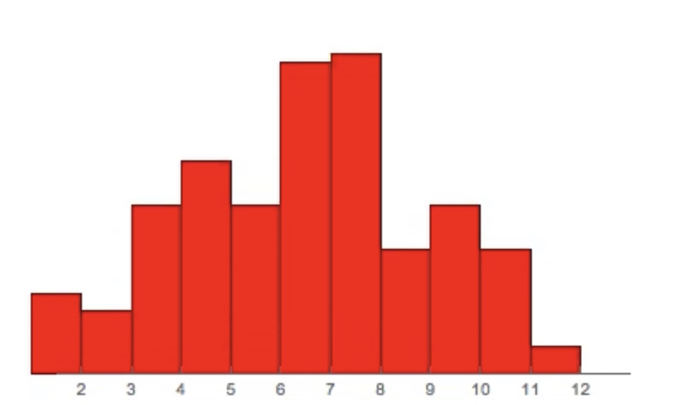
Outcome of a roll of two dices can only be some discrete number between 2-12. Yet as the picture above shows we can easily visualize the distribution of our randomly generated discrete dice throws.
You can also use this histogram to visually detect skewness pretty much the same way as you would for continuous data.
However, even though visual detection of skewness is encouraged in undergraduate statistics courses you should note that it is not very rigorous way of detecting it.
0 comment threads
Does the author specify which definition of skewness is being used? There are several and normally do not rely on looking at histograms.
I am guessing that the author is proposing a (vague) definition of skewness that you could apply to discrete quantitative variables. You could plot an histogram for this and proceed as if you were dealing with a continuous variable.
0 comment threads

0 comment threads