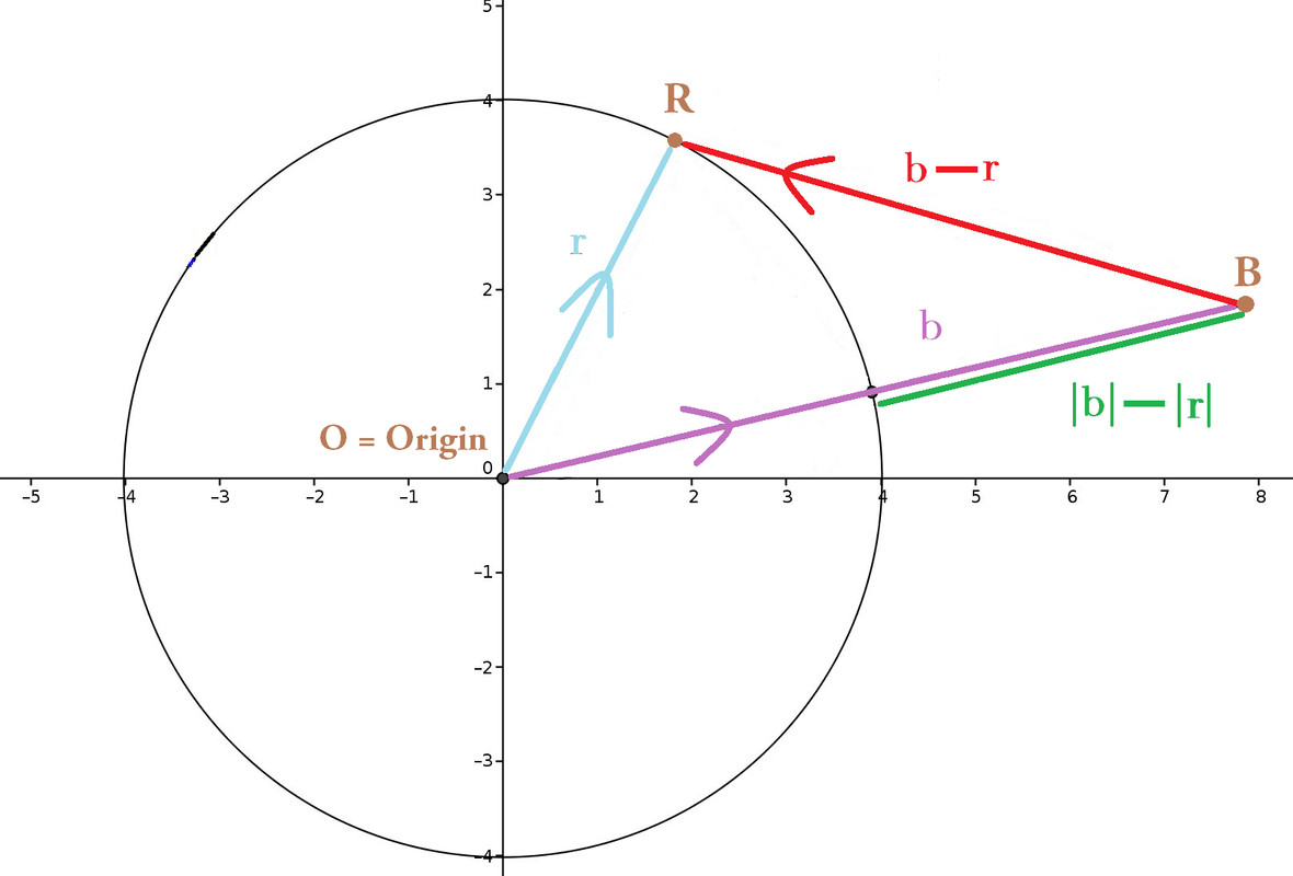
Solely by eye, how can 16 year olds visually distinguish $\color{red}{\vec{b} - \vec{r}}$ from $\color{limegreen}{|\vec{b}| - |\vec{r}|}$ ?
Yearly, I teach 16 year olds the diagram beneath (improvement of this original) that reappears on standardized tests with different letters, orientation, position of the vectors. Tests require students to distinguish and label $\color{red}{\vec{b} - \vec{r}}$ vs. $\color{limegreen}{|\vec{b}| - |\vec{r}|}$. Despite my best endeavors, someone ALWAYS mixes them red and green, whenever this diagram resurfaces on tests!
How do you best explain their pictoric difference? How would you prevent this diagrammatic mix up BY EYE?

2 answers
You are accessing this answer with a direct link, so it's being shown above all other answers regardless of its score. You can return to the normal view.
You need to:
- Explain what a scalar is (pure magnitude)
- Explain what a vector is (magnitude & direction).
As you've drawn the diagram, your intention is clear. $\vec b - \vec r$ (in red) has been labelled (in)correctly (no arrows over b and r). You also wish to emphasize that $|\vec b| - |\vec r|$ (green) is about magnitude by putting both vectors in the same direction.
However, the vector $\vec r$ in $\vec b - \vec r$ is NOT the same as the $\vec r$ in $|\vec b| - |\vec r|$ (different directions). In a sense what you've done is eliminate the differentiating feature of a vector (direction) by doing this and so students will mix up $\vec b - \vec r$ and $|\vec b| - |\vec r|$.
0 comment threads
Use two diagrams. What you have is too cluttered and busy to be useful. I had to look at it a while before understanding what you are trying to show.
What you are really trying to illustrate is the difference between how vectors and scalars subtract. Show one diagram for the difference between two vectors, and another the difference between two scalars. You want them to see how vectors and scalars are different, so show them as different.
Don't clutter the vector diagram with a unit circle and lots of extraneous things in different colors. Just show the triangle of vectors A, B, and B-A. If it isn't clear in black on white, then it isn't clear.
Likewise don't clutter the scalar diagram with any notion of vectors. I would show bars along a number line. There is bar A and bar B, both with one end at 0. The bar for B-A then is between the other ends of A and B.
Make the lengths of A and B the same as the lengths of the two vectors in the other diagram, which you already sized to be nice round numbers. That allows you to contrast the two operations once they are understood individually.
Also, if you're trying to show addition or subtraction of vectors, it helps to show them head-to-tail. Note that you even managed to confuse yourself with that diagram:
You got the direction of the difference vector B-R wrong. If you had show B, then -R starting at the end of B, it would have been obvious that B-R points right and down, not left and up as shown.


1 comment thread