## Fading out the content
*This only addresses MathJax in the content preview, not MathJax in titles.*
If it is decided to go with a fixed maximum height for a question preview, here's a possible solution for the problem mentioned, that equations could be cut in half:
Have a region at the bottom of the fixed height that fades out the content. This makes it clear that the truncation of the question wording is deliberate. This would also avoid the other problem with fixed maximum height of a preview, that a line in a paragraph could be cut in half.
## A quick demo
As Mathematics currently has the preview disabled, I've tested this with the previews on the Electrical Engineering question page. The following images use some MathJax previews from further down the front page, but they aren't quite as tall as the examples here on Mathematics. Hopefully this gives the general idea though.
Below I've shown a few possible changes to the CSS, each followed by the rendered result. Each result is exactly 762 pixels tall, so you can easily see how much extra fits into the same height with the different approaches.
## The current EE Codidact previews, for comparison
This shows how Electrical Engineering Codidact currently looks, with no CSS changes.
## With a max height and fading out the bottom 50%
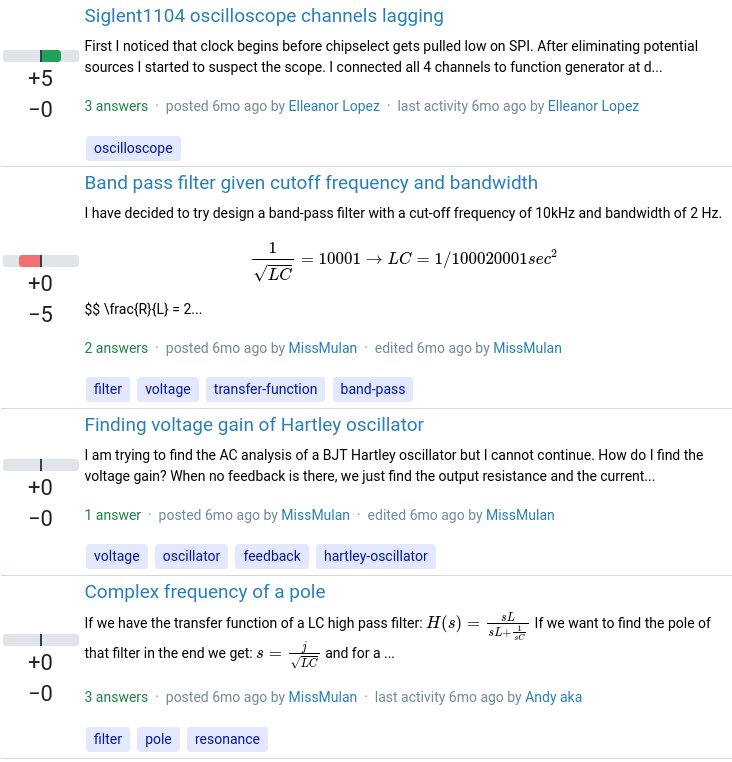
Any preview taller than the height restriction is truncated, but the bottom half fades out gradually so there are no formulae or sentences sharply cut in half.
### CSS
```css
.post-list--content {
font-size: 14px;
mask-image: linear-gradient(black 50%, transparent);
max-height: 5rem;
}
```
### Rendered result
## Fading from a specified height rather than a percentage
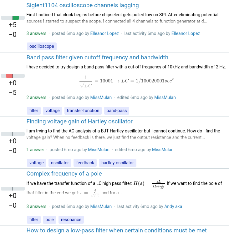
This looks similar for the tall previews, but avoids having any fading on previews that already fit on 2 lines of text and don't need height restriction.
### CSS
```css
.post-list--content {
font-size: 14px;
mask-image: linear-gradient(black 2.2rem, transparent);
max-height: 5rem;
}
```
### Rendered result
## Fading from a specified height with a lower max height
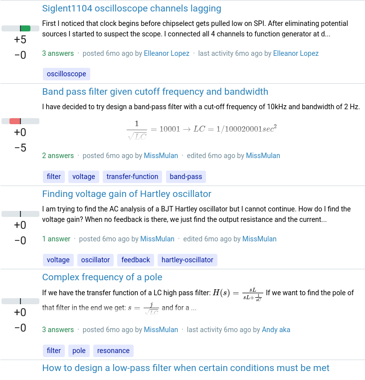
Similar to the previous example, but allows fitting more previews on screen at the expense of further restricting the height of each one.
### CSS
```css
.post-list--content {
font-size: 14px;
mask-image: linear-gradient(black 2.2rem, transparent);
max-height: 4rem;
}
```
### Rendered result
## Fading from a specified height with the lowest max height
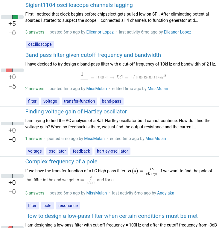
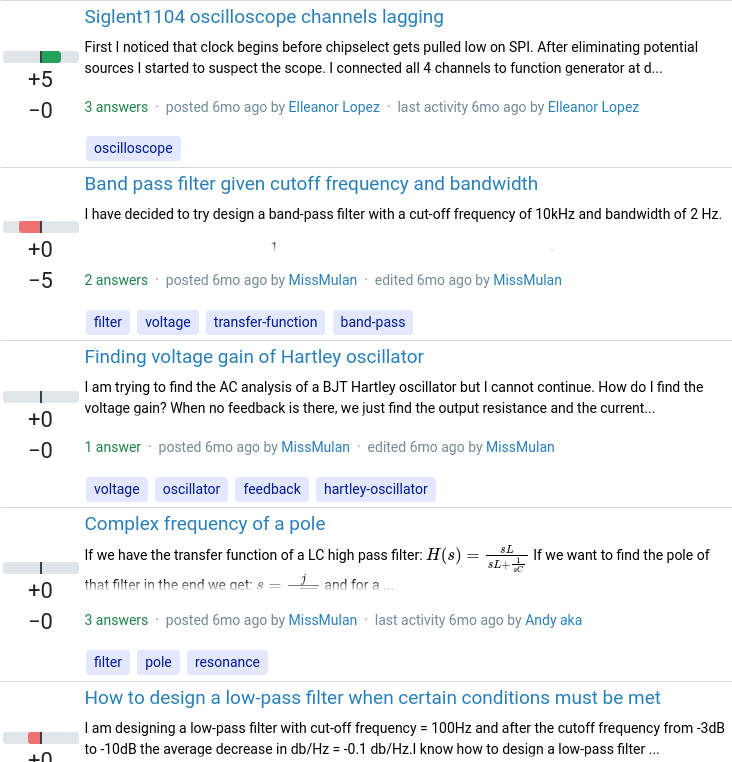
This is probably too much height restriction - included for comparison.
### CSS
```css
.post-list--content {
font-size: 14px;
mask-image: linear-gradient(black 2.2rem, transparent);
max-height: 3rem;
}
```
### Rendered result
---
*(Note that the `font-size: 14px;` is the existing CSS for this class - the `mask-image` and `max-height` are the suggested new properties. I appreciate that it's not a great idea to mix `px` and `rem` - this was just a quick demo to gather opinions.)*


