Neither of those charts presents those integrals; the first illustrates annually compounded interest, and the second compares a few different compounding schedules to continuous compounding, but not in a way that highlights the integrals in the text explanation.
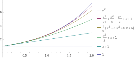
If you wanted an illustration of those integrals stacking up to form $e^x$, it'd look something like this:
[](https://www.wolframalpha.com/input/?i=Plot%5B%7Be%5Ex%2C+1+%2B+x+%2B+%281%2F2%29+x%5E2+%2B+%281%2F6%29+x%5E3+%2B+%281%2F24%29+x%5E4%2C+1+%2B+x+%2B+%281%2F2%29+x%5E2+%2B+%281%2F6%29+x%5E3%2C++1+%2B+x+%2B+%281%2F2%29+x%5E2%2C+1%2Bx%2C+1%7D%2C+%7Bx%2C+0%2C+2%7D%5D)
This graphic can be interpreted as an illustration of continuous interest at a rate of 100%. The gap between the x-axis and the bottom curve represents the principal, which does not grow. The gap between that curve and the next one up represents the interest being earned by that principal, the next gap represents the interest being earned by the previous gap, and so on. The top curve, $e^x$, is the limit of this process if carried on infinitely. The gaps between the curves are the integrals that you're asking about; each gap is the derivative of the height of the next one.


